
" height="15.714285714285712px" id="HuUY1YOMY" transform="translate(2 4)" width="20px"/></svg>)
" height="18px" id="smOoqr7Ui" transform="translate(3 3)" width="18px"/></svg>)
YukTrip.com Landing Page Redesign | Case Study
Improving Yuktrip’s Landing Page Experience Through Visual Hierarchy and Brand Refresh

Client:
YukTrip.com
Category:
Web Design, Landing Page
My Role:
UI/UX Designer
Tools
Figma
Yuktrip is an eSIM service platform that helps travelers purchase internet packages for international destinations.
With many supported countries available on the platform, the landing page plays an important role in introducing the service, helping users explore destinations, and communicating product information clearly.
This project focused on redesigning Yuktrip’s landing page following the company’s updated logo and visual identity. The goal was to improve the overall browsing experience through better visual hierarchy, clearer section flow, and a more cohesive interface direction while still maintaining the existing content and business messaging.
The redesign mainly focused on refining how information was visually presented across the page by improving layout composition and browsing flow to create a cleaner and more approachable experience.
My Scope
Freelance visual design project. Worked as the sole designer over 2 weeks, responsible for translating Yuktrip's updated brand identity into a refreshed landing page design. Deliverable was a final design file handed off directly to the client, no development handover involved.

The Challenge
Improving the visual flow and hierarchy across Yuktrip’s landing page.
The previous landing page already contained the necessary information and service introduction, but several sections shared relatively similar visual treatment and spacing throughout the page.
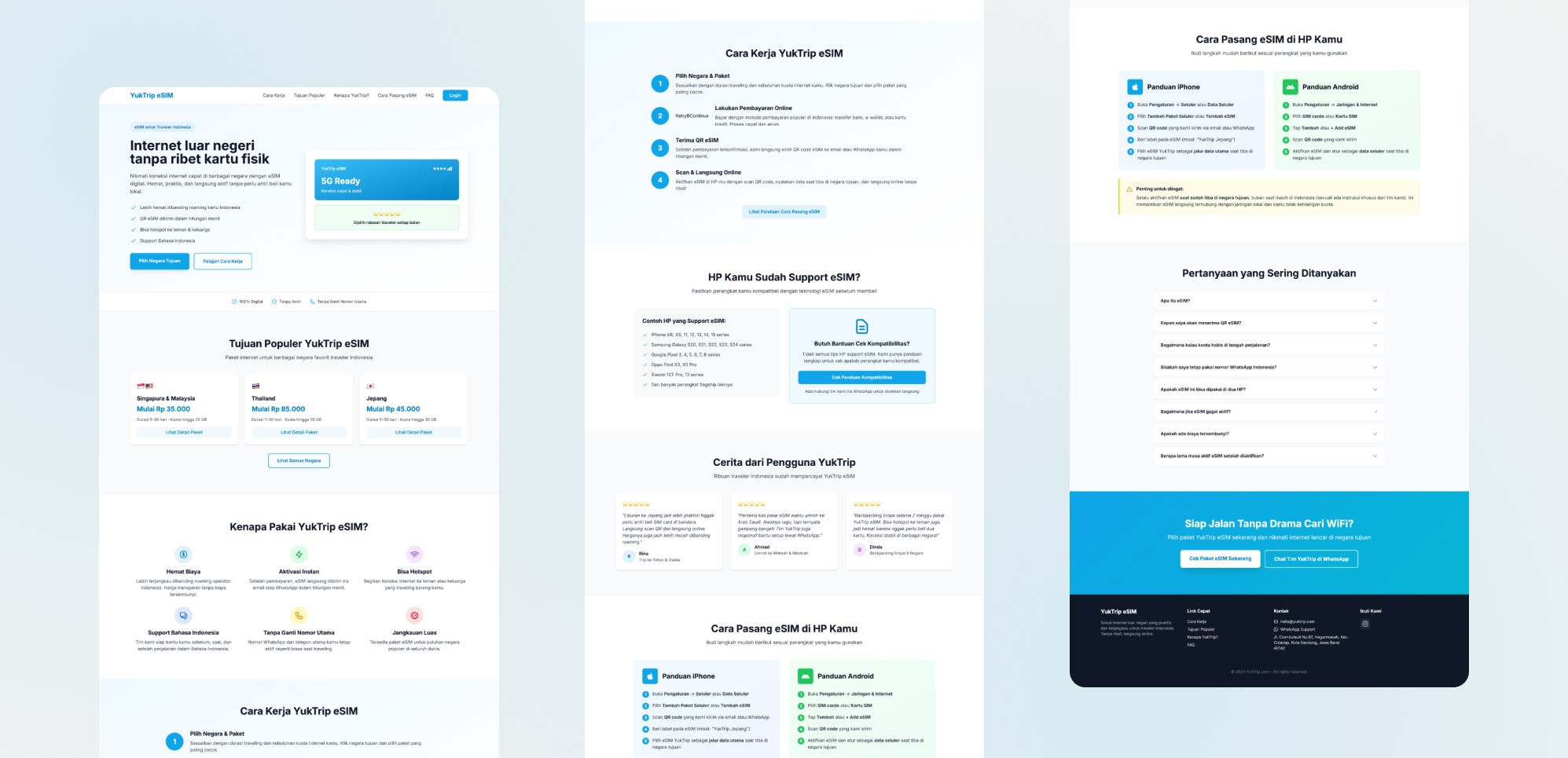
This caused the browsing experience to feel visually flatter, making it harder for users to distinguish content priority and navigate the page more intuitively.
Although destination browsing was already available, the section lacked stronger visual emphasis despite being one of the platform’s main offerings. Call-to-action areas also felt less prominent, causing the page to communicate information more passively rather than actively guiding users toward exploration.
The redesign also needed to align with Yuktrip’s updated branding direction, requiring a refreshed interface style that felt cleaner, more modern, and visually more cohesive.
Design Approach
Refining the landing page through visual restructuring and hierarchy improvements.
Aligning With the New Brand Identity
The redesign process started by adapting Yuktrip’s updated logo and visual direction into a more cohesive landing page experience.
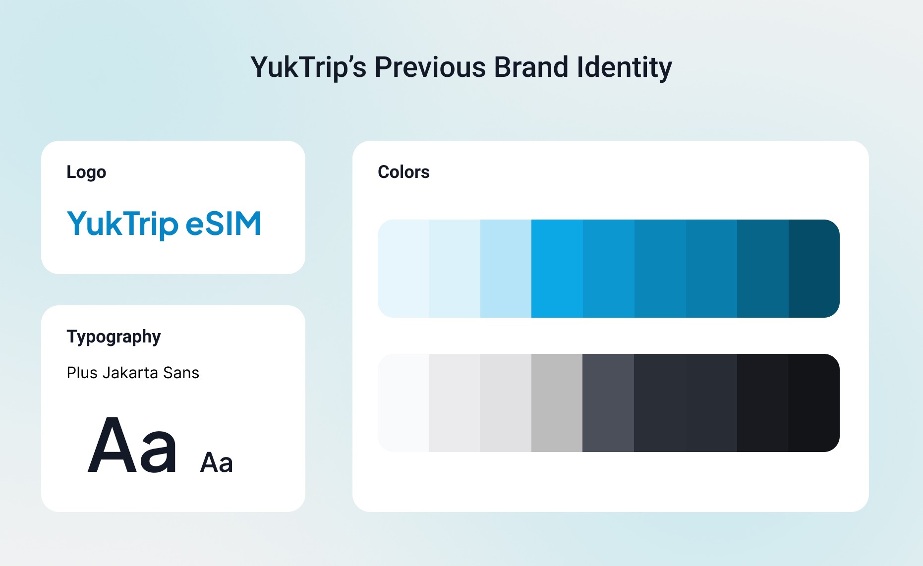

The client already had several visual references that reflected the branding direction they wanted to achieve.
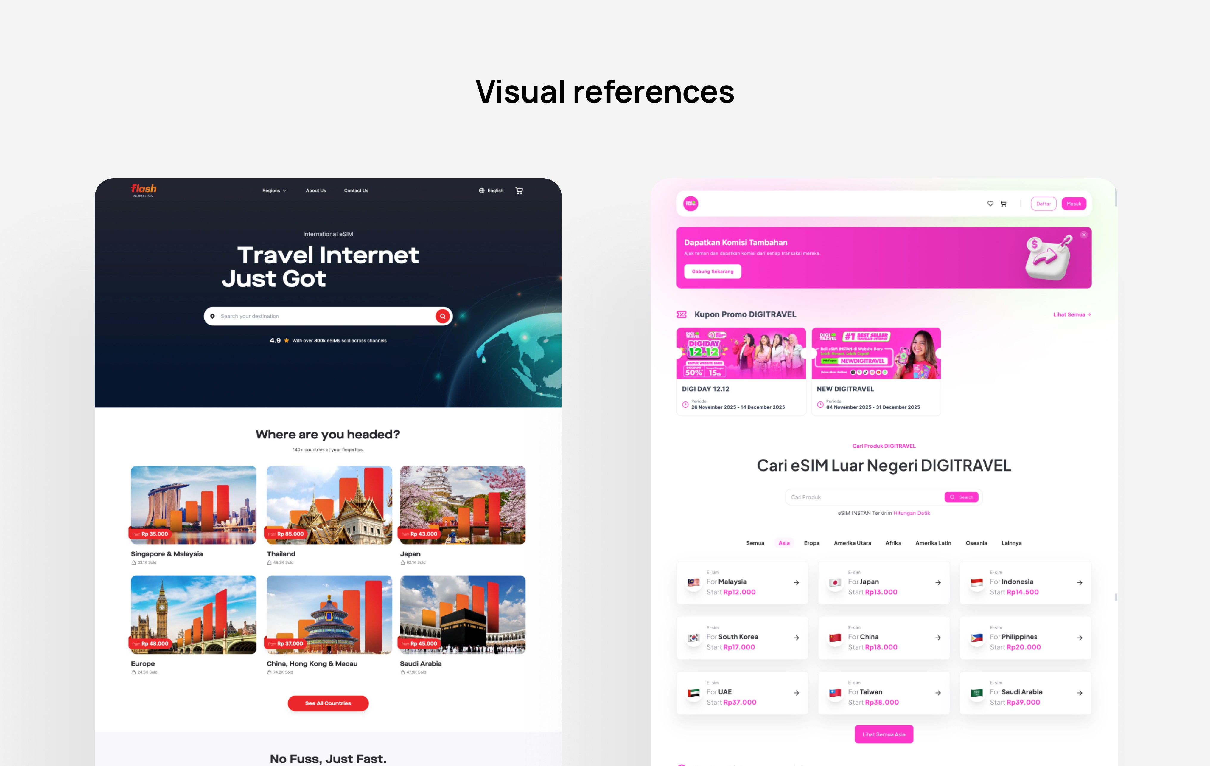
These references became an important starting point during the redesign process, helping define the overall visual tone, layout approach, and interface direction for the new landing page.
The updated green color palette also helped strengthen the brand presence throughout the page while creating a lighter and more approachable browsing experience.
The core challenge was translating Yuktrip's updated logo and visual identity into an existing landing page structure without rebuilding the content or page flow from scratch. This required balancing the new brand direction with the existing information architecture, Improving how the page felt visually while keeping the content and messaging intact.
Improving Visual Hierarchy
One of the main focuses of the redesign was improving how users visually moved through the page.
In the previous design, several sections used similar spacing and visual weight, causing the browsing rhythm to feel more repetitive across the long landing page. To improve this, the redesigned layout introduced clearer separation between sections through more intentional spacing, grouped content containers, and stronger hierarchy between headlines, supporting information, and call-to-action areas.
This helped create a more structured reading flow while making the page feel easier to scan and navigate overall.
Destination exploration was also given stronger emphasis earlier within the page to help users immediately recognize Yuktrip’s international coverage and core offering.
Refining Content Presentation
Although the overall content remained mostly unchanged, the presentation of information was refined significantly throughout the redesign process.
Several sections were reorganized visually to improve readability and create a cleaner composition across the page. Card layouts became more structured, supporting information became more consistently grouped, and content spacing was adjusted to create better visual rhythm throughout the browsing experience.
The redesign focused on improving how the existing information was experienced visually while still maintaining the original messaging and page structure.
Design Exploration & Iteration
The project went through multiple design explorations before reaching the final direction.
Several alternatives were explored for the hero section, destination browsing layout, section composition, spacing system, and CTA placement. Because the redesign focused heavily on presentation and visual flow improvements, iterative exploration became an important part of evaluating which layout direction felt the clearest and most balanced visually.
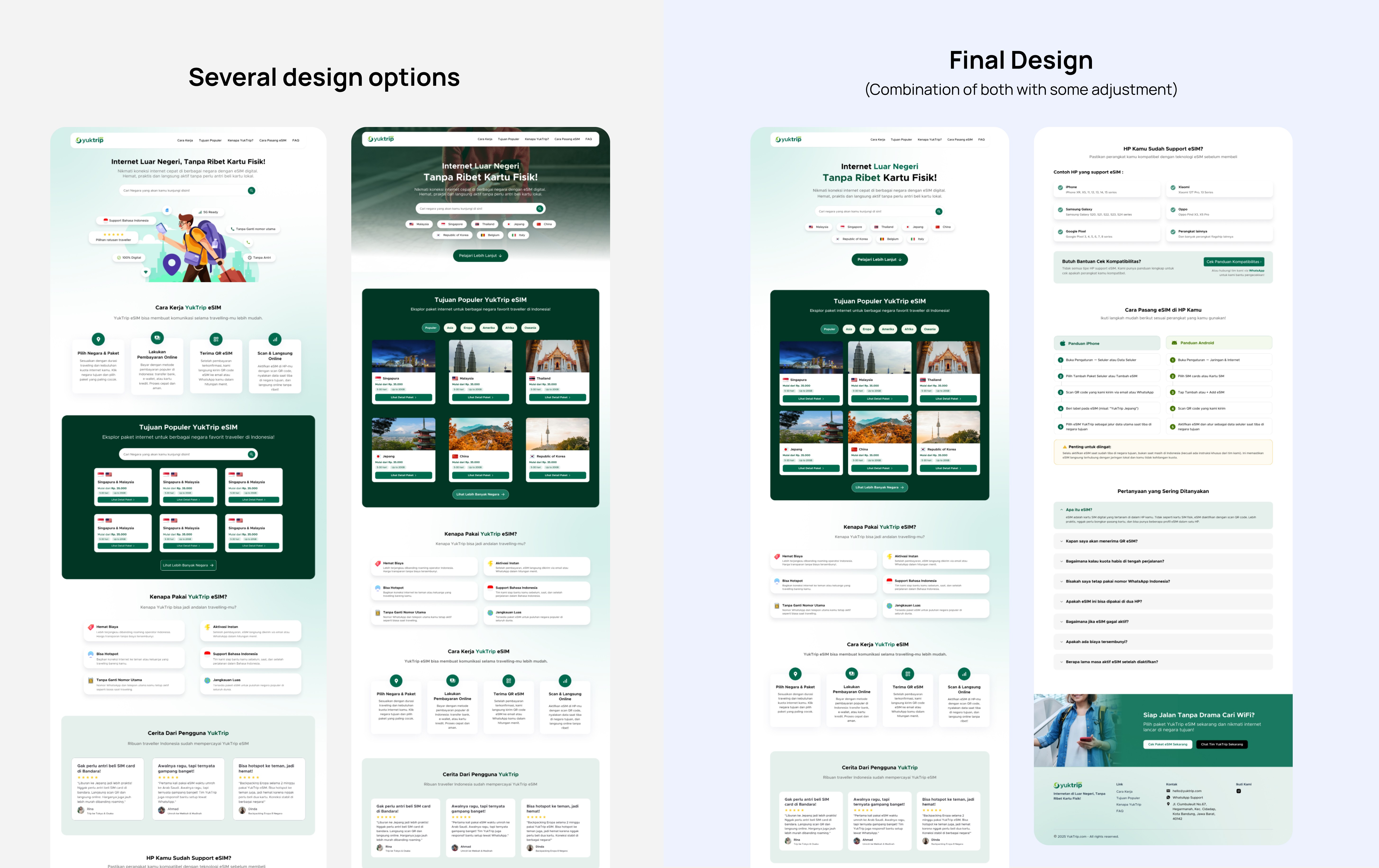
Rather than dramatically changing the structure, the process focused on refining how users navigated the page and how the overall experience could feel cleaner, lighter, and more organized.

Final Solution
A cleaner and more cohesive landing page aligned with Yuktrip’s refreshed visual identity.
The final design file delivered a refreshed landing page aligned with Yuktrip's updated brand identity with cleaner layout, stronger visual hierarchy, and a more cohesive browsing experience built around the new color palette and visual direction.
Reflection
Small structural refinements can significantly improve how a landing page feels to navigate.
This project reinforced how strongly visual hierarchy, spacing, and layout composition influence browsing behavior, even without major changes to the content itself.
Because the project focused on refining an existing structure rather than rebuilding the experience entirely, the challenge was finding ways to improve clarity and browsing flow while still maintaining the original messaging and business needs.
The redesign highlighted how thoughtful visual organization and stronger hierarchy can make an experience feel significantly more modern, approachable, and easier to navigate through relatively small structural improvements alone.
Related Projects

